Juha Jordan, Tiina Vuorio, Mariia Ovanesova & Päivi Laaksonen
Perceiving colors is an important part of our everyday life. Often, even the slightest changes in color contain lots of valuable information for us. Based on color, we can for example see the difference between raw fruit from ripe fruit or wet surface from dry surface just with a single glance. We embrace beautiful colors and paint our surroundings with them, because color schemes can even affect our mental state (Yildirim et al., 2007).
We humans see colors, when electromagnetic radiation with wavelengths between 380 and 750 nanometers hits the cone cells in our eyes. Thus, the wavelengths between 380–750 nanometers are called visible light (Leach, 1971). In our eyes, the cone cells convert wavelengths around 420 to blue, wavelengths around 530 to green and wavelengths around 560 to red color signal (Jacobs, 2008). When those signals reach our brain, they are converted to actual colors. For example, from red and blue signals, our brains automatically form purple without us having to consciously think about the conversion process at all. Because almost every material reflects its own unique mixture of different wavelengths, we get a huge amount of information just by looking at colors around us.
Because concept of color is so important to us humans, we have developed a variety of mechanisms to measure color. Usually color is measured with spectrophotometer, which collects the radiation reflected or absorbed from the measured object and forms a spectrum. The spectrum of wavelengths can be then converted into a single coordinate in the three-dimensional CIELAB color space, which gives an unambiguous representation of the color that was measured. The axes of the color space express lightness (L), color shift from red to green (a) and color shift from yellow to blue (b). In CIELAB color space, the smaller distance there is between two coordinate points, the more similar the corresponding two colors appear to the human eye. Besides the CIELAB color space commonly used in spectrophotometry, there are also other common three-dimensional color spaces, for instance RGB, where the axes represent amount of red, green and blue light reflected by the measured object. (Fairchild, 2005)
Thermochromism affects spectrum
The ISO 18314-1:2015 standard for analytical colorimetry states that color measurements should always be done within 23 ± 2 ℃ temperature range if the color of the sample is temperature-dependent. The standard does not elaborate this statement any further, but it is based on a physical property called thermochromism. Thermochromism means that reflectance spectrum of a material is affected by changes in temperature. Usually thermochromic effect is achieved, when structure or composition of the material itself changes as temperature changes. This kind of thermochromism can be found in thermochromic pigments used to create color-changing objects and textiles, for example Tefal® frying pans or mugs that change color when hot liquid is poured into them (Bamfield, 2001).
However, thermochromism influences all materials, not only those which change their composition or structure during temperature changes. For instance, many organic and inorganic dyes go through changes in color at increased temperature. The color change origins from different reasons depending on which type of molecule or compound are considered. For organic molecules, temperature may affect the chemical equilibrium between two differently colored states and increasing the temperature may lead in a situation where the color changes compared to the starting composition. In the case of inorganic dyes, the change in the temperature may affect the excitation or luminescence energy of the compound leading to widening of the absorption peaks, which leads to absorption of a wider selection of wavelengths (Babkina et al., 2014). The widening of the absorption peaks, on the other hand, result to narrower peaks in the reflectance spectrum, which affects the color of the material. Also, as the peaks get narrower, they move slightly towards the higher wavelengths. (Hiltunen, 2002)
Based on thermochromism and on the knowledge that materials have their own unique spectra, we can deduce that when temperature changes, some materials must change their color more than the others. Surprisingly, the main thing which determines how much certain material changes its color when temperature changes is the color itself. Colors with long wavelengths such as orange and red have the highest tendency for temperature-based color changes, whereas very neutral colors with same amount of all wavelengths such as white and black have the lowest tendency for color change. Colors with short wavelengths such as blue and violet fall in the middle of this category. (Malkin et al., 1997)
To understand how different materials exhibit thermochromism, we must examine how their reflectance spectra are affected by temperature changes. Some examples of reflectance spectra at different temperatures are shown in Figure 1. Data for these examples was created to demonstrate the effect of temperature to different spectra, and it is not a result from a set of colorimetric measurements. Also, for demonstrative purposes, the differences between spectra of cold and warm objects have been made larger than in real life cases. All the imaginary cases and explanations for them have been created based on studies of Malkin et al. (1997), Compton (1984), Fairchild et al. (1985), Verrill et al. (1986) and Hiltunen et al. (2002).
In Figure 1, we see the reflectance spectra of imaginary red, blue and black materials in warm and cold temperature. In Figure 1, total reflectance of the material is the area left under the curves. Narrowing of the spectral peaks results in total reflectance loss, which is the area left between the cold and warm curves. As seen in Figure 1, narrower reflectance peak of the warm material causes reflectance loss in areas, where the spectral curve is steep. The steeper the slope and higher the peak, the larger the spectral shift and thus the color change is.
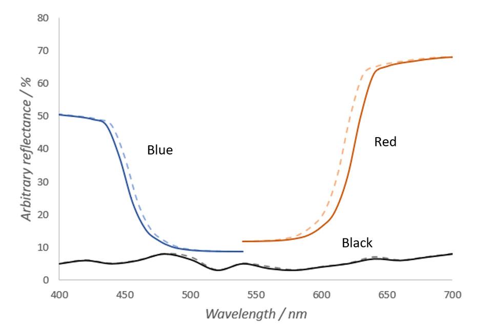
In Figure 1, it can also be seen that the spectrum of an imaginary blue object changes less that the spectrum of the red object. Based on the physics of electromagnetic radiation, in shorter wavelengths the differences in spectra in different temperatures are substantially smaller and thus the total loss of reflectance is smaller. Also, caused by the peak very slightly moving towards longer wavelengths, the spectral differences caused by temperature change are larger in rising edges of the peaks than in the falling edges of the peaks. These are mainly the reasons why objects with lots of red hues change their color more than objects with green or blue hues when temperature changes. (Hiltunen, 2002)
Contrary to red and blue objects, the reflectance spectrum of an imaginary black object does not change almost at all when temperature changes. As can be seen from the Figure 1, spectrum of the black object does not have any steep slopes. Thus, temperature changes do not affect the color of the object. The same principle applies to any other object with a very neutral color.
Color changes in ceramic tiles and metal sheets
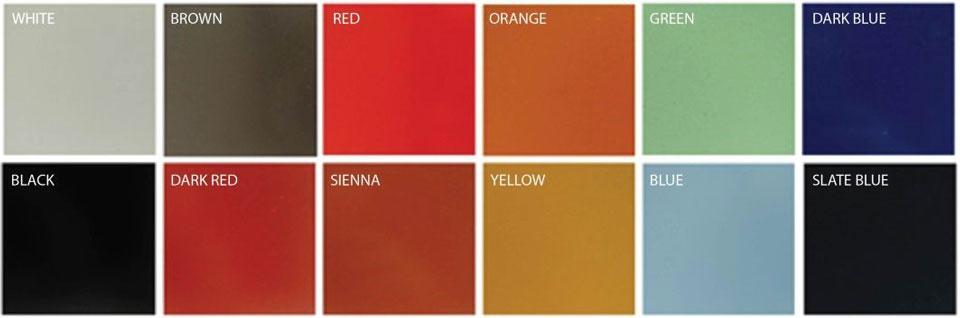
In almost every study considering thermochromism, the experiments have been made using ceramic color tiles as samples. However, no such studies have been done to metal samples. At HAMK Tech, we carry out color measurements frequently on paint-coated metal sheets, which makes it important to experiment with the actual studied material instead of the ceramic tiles. Twelve metal sheets of different colors were chosen for testing. The colors of the sheets are shown in Figure 2.
First, spectra and color coordinates of the samples were measured in 21 ℃ temperature. After that, the samples were heated, and spectra and the color coordinates were measured at 32 ℃ and 38 ℃. Color coordinates at 21 ℃ were chosen as the reference points, based on which the color differences at 32 ℃ and 38 ℃ were calculated. Termaks oven was used to heat the samples and DataColor 600 spectrophotometer to measure colors of the samples. In all color measurements, d/8 geometry and D65 illuminant were used, and specular reflectance was included. The color differences in CIELAB color space were calculated using the following equation (Hunt, 2004):
where
ΔE = color difference in CIELAB color space
L = lightness of the sample
L21 = lightness of the sample in 21 ℃
a = green-red component of the sample
a21 = green-red component of the sample in 21 ℃
b = blue-yellow component of the sample
b21 = blue-yellow component of the sample in 21 ℃
Color differences of each sheet in temperatures of 21 ℃, 32 ℃ and 38 ℃ were then plotted and examined. The results are shown in Figure 3.
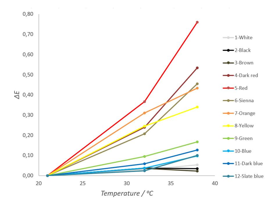
As seen in Figure 3, samples with red hues change their color most and samples with neutral colors change their colors least. It is also notable that besides black, white and brown, the all other colors are arranged by their place in the visible light spectrum. This tendency correlates well with experiments done to the ceramic tiles and fits to the theory discussed earlier. The ΔE for red metal sheet in this test was 0,44 units per 10 degrees of Celsius. Depending on colors, human eye can see the difference between two colors approximately when the ΔE value exceeds 0,5 units (Hiltunen, 2002). Thus, the color changes of red and dark red metal sheets used in this experiment can be seen by an average human observer with a normal color vision.
Figure 4 shows the reflectance spectra of each sample in 21 ℃ and the measured differences in spectra when temperature is dropped from 38 ℃ to 21 ℃.
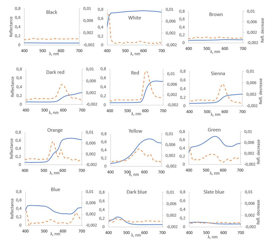
In Figure 4, the solid lines show spectral curves of the samples at 21 °C and the dashed lines show the difference between the spectra before and after the temperature increase. As shown in the figure, all spectra change the most in those wavelength areas, where the spectral curves rise steeply. Good examples of spectral changes like this can be seen for instance in red and dark red samples around 550–630 nm area. Looking at the blue and dark blue samples in 490–530 nm area, very minimal changes in reflectance also happen where the spectral curves fall. When temperature rises, the largest decreases in reflectance happen in red, dark red, sienna and orange samples in the areas where their spectral curves rise steeply. The black, white, brown and slate blue samples show almost no spectral changes when the temperature increases because of absence of steeply rising and falling parts in their reflectance spectra.
Qualitatively, our results measured from coated metal sheets resemble results published earlier on ceramic samples, but there are some quantitative differences in the color changes. The bright red ceramic tile in measurements carried out by Malkin et al. changed its color about one ΔE unit per 10 degrees of Celsius, which is substantially larger than the 0,44 ΔE units per 10 degrees of Celsius achieved in this experiment. This difference may result from fast cooling of the surface of a metal sheet and from differences between the color measurement devices. The spectral data achieved in this experiment looks very similar to the data achieved by Compton (1984) and Malkin et al. (1997). Similarities between all three datasets suggest, that in changing temperatures, there is no substantial differences in spectral changes between ceramic tiles and metal sheets.
From theory to practice
As the study published by Malkin et al. shows, it is possible to determine all temperature-based changes in a spectrum and thereby form a correction table for the color changes at different temperatures (Malkin et al., 1997). However, the spectra of materials are very complex and variable, which makes the formation of such correction tables for each material very time-consuming. Because the thermochromic effect seldom causes any practical problems, there has not yet been any exhaustive research on calculating the color change when the temperature changes. As it stands, color measurements done at different temperatures cannot be compared reliably.
For objects which do not alter their structure or composition when temperature changes, the thermochromic effect happens mostly outdoors, where a wide range of temperatures occur during the year. Usually, the thermochromic effect is irrelevant because the color changes are very small. Small color changes become relevant for example in situations, where the change of color is measured over time to determine the stability of color on a surface. These long-term durability experiments are often done outdoors, where the samples are naturally exposed to sunlight, dirt, rain etc. If outdoor temperature changes a lot during the test period, it is advised to move the samples indoors to a standard temperature and do the color measurements there.
Authors
Juha Jordan works as a research engineer in HAMK Tech.
Tiina Vuorio works as a research engineer in HAMK Tech.
Mariia Ovanesova worked as a research assistant in HAMK Tech.
Päivi Laaksonen works as a principal research scientist in HAMK Tech.
References
Babkina, M., Nikonorov, N., Shakhverdov, T., Shirshnev, P., & Sidorov, A. (2014). Luminescent thermochromism in potassium-alumina-borate glass with copper-containing molecular clusters at elevated temperatures. Optical Materials, 36(4), 773–777. https://doi.org/10.1016/j.optmat.2013.11.019
Bamfield, P. (2001). Chromic Phenomena: The Technological Applications of Colour Chemistry (1st ed.). Cambridge, The Royal Society of Chemistry.
Compton, A. (1984). The Thermochromic Properties of the Ceramic Colour Standards. Color Research and Application, 9(1), 15–22. https://doi.org/10.1002/col.5080090104
Fairchild, M. (2005). Color appearance models (2nd ed.). West Sussex, John Wiley & Sons Ltd.
Fairchild, M., & Grum, F. (1985). Thermochromism of ceramic reference tiles. Applied Optics, 24(21), 3432–3433. https://doi.org/10.1364/AO.24.003432
Hiltunen, J. (2002). Accurate Color Measurement. Doctoral dissertation. University of Eastern Finland, Joensuu, Finland. Retrieved August 27, 2020 from http://www.cs.joensuu.fi/~spectral/publications/Hiltunen.pdf
Hiltunen, J., Silfsten, P., Jääskeläinen, T., & Parkkinen, J. (2002). A qualitative description of thermochromism in color measurements. Color Research & Application, 27(4), 271–275. https://doi.org/10.1002/col.10062
Hunt, R. (2004). The Reproduction of Colour (6th ed.). West Sussex: John Wiley & Sons.
Jacobs, G. (2008). Primate color vision: A comparative perspective. Visual Neuroscience, 25(5–6), 619–633. https://doi.org/10.1017/S0952523808080760
Leach, C. (1971). Chapter XXIII A Practical Guide to the Effects of Visible and Ultraviolet Light on Fungi. Methods in Microbiology, 609–664. https://doi.org/10.1016/S0580-9517(09)70028-5
Malkin, F., Larkin, J., Verrill, J., & Wardman, R. (1997). The BCRA-NPL Ceramic Colour Standards, Series II – Master spectral reflectance and thermochromism data. Journal of the Society of Dyers and Colourists, 113, 84–94. https://doi.org/10.1111/j.1478-4408.1997.tb01873.x
Verrill, J., Compton, J., & Malkin, F. (1986). Thermochromism of ceramic color standards. Applied Optics, 25(18), 3011. https://doi.org/10.1364/AO.25.003011
Yildrim, K., Akalin-Baskaya, A., & Hidayetoglu, M. (2007). Effects of indoor color on mood and cognitive performance. Building and Environment, 42(9), 3233–3240. https://doi.org/10.1016/j.buildenv.2006.07.037