Marianne Engen Matre, Rune Andersen, Maren Schelbred Thormodsæter & Mauricio Omar Cifuentes
“What’s in it for me”? This is often the first question encountered when developing resources for almost any organization or enterprise. It is usually followed by “How much time does it take to complete the course”? When it comes to the introduction of online courses in digital competence our experience is that the questions remain the same, but a new one also appears: “How can I access and understand this information”? Most educational facilities, as well as commercial actors in the Norwegian context, have neglected the fact that in order to make information available to all, a stronger focus must be put on universal design. This was the challenge we faced when we were given the task of creating a resource enabling all employees in a governmental enterprise, with approximately 750 employees, to gain basic digital competence. As digital competence is an evolving concept which contain a number of interpretations and overlap with terms of similar content such as digital literacy or ICT-skills, we will in the following refer to digital competence as it has been defined by Ilomäki and colleagues (2014, p. 655). “Digital competence is defined as consisting of (1) technical competence, (2) the ability to use digital technologies in a meaningful way for working, studying and in everyday life, (3) the ability to evaluate digital technologies critically, and (4) motivation to participate and commit in the digital culture”.
The course was created as a bid for a tender put out by a national enterprise in the Norwegian public sector. Though the students were employees in an enterprise, they will be referred to as students in this article, as this is their role in the online course. The enterprise required a course adapted for a diverse student group. Their workforce contains a larger group of employees with special educational needs due to disabilities such as sight and hearing impairments. In planning and designing the course, we consider universal design not as an approach for this limited group of students, but as an approach that improved the course in general. Planning the course, we wanted to raise awareness of practical solutions and consider barriers and opportunities for the why, what and how of learning as described in the UDL framework (CAST, 2018). This was an initiative that required the cooperation of three different departments at our University, the Faculty of Engineering and Science, the Faculty of Humanities and Education and the ICT Department. Based on a structure and a course architecture decided in advance, each department developed content for the course, either based on manuscripts or from scratch.
Our course was developed and is currently running on the learning platform Canvas. Canvas is a web-based learning platform that enables instructors to plan, evaluate, automate administration, report training events and implement the learning process (Ellis, 2009). Every participant was a registered student at the University of Agder in Norway. This provided better overview and security of data as well as the possibility of personal feedback and examination. A project group consisting of participants from the University and the national enterprise monitored the implementation phase and continues to evaluate and promote the project throughout the duration of the course. We also had a test group which included users of assistive technology, such as Braille displays. In addition, the course was evaluated by an independent third party, specializing in Universal Design of web solutions. This has resulted in continuous alterations of the course which has improved its quality and accessibility.
Design and implementation of the initiative
When the call went out for this project, several issues needed to be addressed. Some of these concerned accessibility and differentiation of content and assignments. Thus, we decided to design a course divided into two main paths: one basic level, in which the participants were introduced to what we considered basic digital knowledge in today’s work environment, and level 2, for more experienced ICT-users. Students who completed both levels earned credits (7.5 ECTS credits, European Credit Transfer Scheme), while those who completed level 1 received a course certificate. Thematically, the course was divided into five main modules: Introduction, Collaboration/Co-creation, Multimedia (video, images and sound), Security and Digital tools. When creating each module, we considered the requirements presented by the enterprise and theoretical approaches to inclusive e-learning.
Universal Design for Learning (UDL)
Aiming to implement an inclusive e-learning course, we applied the following theoretical frameworks: The Web Content Accessibility Guidelines (WCAG 2.0), the International Classification of Functioning, Disability and Health (ICF), and Universal Design for Learning (UDL, see CAST, 2018). Designing the course, we followed the WCAG 2.0. standard as presented by The Norwegian Agency for Public Management and eGovernment (uu.difi.no). The standard consists of 12 guidelines organized under the principles of perceivable, operable, understandable and robust (Caldwell et al., 2008). We used the World Health Organization’s ICF to identify potential barriers and facilitate a course that aimed to extend the functioning levels of persons with disabilities (World Health Organization, 2001; Bencini et al., 2018). The student group consisted of persons with hearing, sight and langauge impairments. UDL functioned as a suitable framework for our pedagogical approach when constructing the online course. In the following we will present examples of how the UDL Guidelines were embedded into the course. We have used the established headings from the UDL Guidelines and provide examples from our course.
Multiple Means of Representation
Course content was provided through different formats such as text, video, animation, theoretical models, graphical elements and photos. In addition, we aimed to provide flexibility to the different formats. We added subtitles to all videos, and those consisting of information which was only visually perceivable, were provided with audio-description. For example, in an animated video in the security module, learners were introduced to a virtual employee who caused a number of security breaches. This content is only provided visually through the animation. However, as we added audio description, visual content was described and made accessible to students with visual impairments.
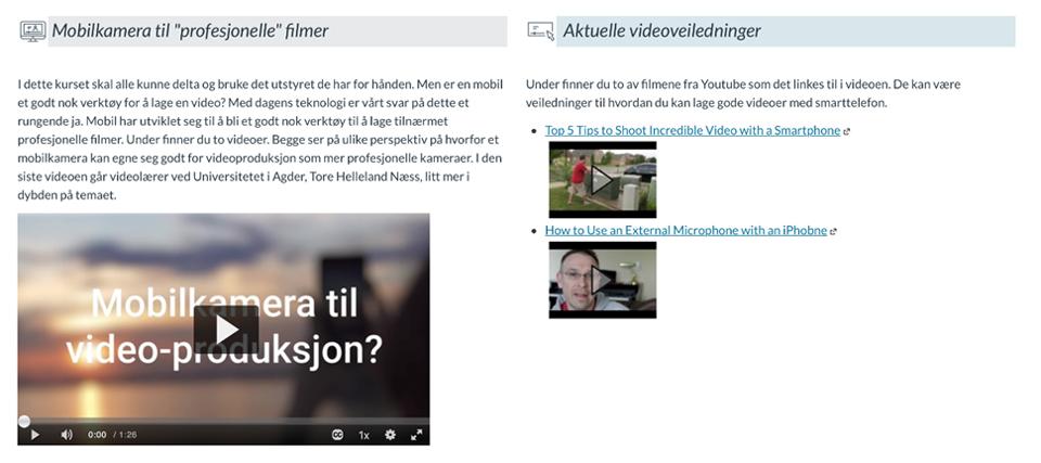
The course interface was designed in a two-column layout (see Figure 1). This provided students with the opportunity to enlarge texts, images and other graphical elements without having to scroll back and forth to capture the entire content. All content was categorized according to three major themes, each illustrated with a symbol embedded with alternative text. The three categories were “main course content”, “optional in-depth content” and “relevant video lectures”.

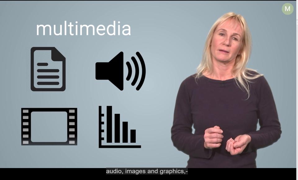
An area in which the course design and course content overlapped, regarded multimedia construction and learning. In the multimedia module we introduced Mayer’s (2001) cognitive theory of multimedia learning as a theoretical framework for video production. Mayer’s theory focuses on designing content that prevents cognitive overload, while at the same time targeting the deep understanding of the material by engaging the student’s cognitive processes of organization and integration. For example, by building on previous knowledge and providing both visual and auditory material (Mayer & Moreno, 2010). The students were introduced to Mayer’s 12 Principles of Multimedia Learning (Mayer, 2001), while we aimed to follow the same principles when producing video content for the course. Thus, we tried to be role models in designing and creating course content to provide the students with illustrative examples (see Figure 2).

The course curriculum contains academic and digital terminology that might be foreign to some, or even most of the students. In order to bridge the gap between the students’ previous knowledge and the curriculum, we provided a glossary and illustrative videos. Subject specific terminology was introduced, for example when describing “the master shot technique”, we provided a short text on how to shoot a film according to this style, and showed a video produced with the technique. When we later referred to the “master shot technique” we linked back to the page where this terminology was introduced. A glossary was part of the introduction module, giving learners short descriptions of frequently used digital terminology. We provided the students with the opportunity to download the glossary as a separate document.
As a number of the participating students were users of sign language, we created flexible assignments that could be solved either by using verbal speech or by sign language. In one of these assignments the students were asked to create a “how-to video”. Such videos are often combined of a continuous video shot and a voice-over audio track. The video shows how something is done, while the voice-over describes the different steps and elaborates on details in the process. A voice-over video was not an option for the users of sign language who often do not produce verbal speech. Thus, we instructed all students on how to produce frame in frame videos, giving the sign language users the opportunity to use this technique when describing the content in their “how-to videos”. The technique was not only a resource for the sign language users, but also a useful tool for all the students who learned the technique.
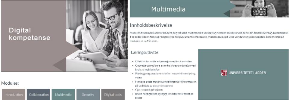
In designing for comprehension, the modules have been color coded to make navigation between them more intuitive. The same color has been used throughout each module, for example in the background of instructional videos and on headings. The intention from our team of developers, was that key elements from each module would be easier to recognize and navigate back to, with color coded modules (see Figure 3). According to WCAG 2.0. (Caldwell et al., 2008) level AA the contrast ratio was set to at least 4.5:1 for normal text, 3:1 for large text and at least 3:1 for graphics and user interface components. A limitation of the color coding, which will be altered in future courses, is that the colors have not been considered in relation to color vision deficiencies (as described in WCAG 2.0 section 1.4.1.). For students with color vision deficiencies, the current background colors may look identical.

Multiple Means of Action and Expression
The learning management platform Canvas provided both opportunities and challenges concerning available and understandable navigation. The navigation buttons at the bottom of each page labelled «previous» and «next», created opportunities for easily understood navigation between pages. However, for users of screen readers the information on the buttons was read out twice, as both the description of the button (for example «next») and the text on the button («next») was read out loud. Feedback from user testing showed that the middle columns was not available to all screen readers, excluding these users from navigating between key pages such as the overview of modules, assignments and discussions.
For each assignment the course provides a grid describing the main areas of assessment. Initially we aimed to describe what characterizes a very good assignment, a good assignment, an acceptable performance and so forth. However, as we started to use the marking grid it proved difficult to distinguish between the different levels on some assignments as areas of assessment overlapped, and the level of achievement could for example be considered to be either good or just acceptable, depending on how marking criteria were interpreted. To define precise and versatile assessment criteria has proven to be a challenge, and we continue to develop and test out the assessment grid.
Multiple Means of Engagement
To capture students’ interest, we introduced each module with an inspirational video highlighting some of the module’s content and describing how this will be relevant to students’ profession. Each module was also introduced with a set of learning goals. These learning goals were later referred to in the assessment criteria to create coherence.
The course is self-paced. Each student group had approximately six months to complete the course. The course length varied between groups as the enterprise desired flexibility on opening and closing dates. We were able to provide this flexibility, and the students had only two deadlines during the entire course. Our aim was to create transparent and reliable course content, enabling students to monitor their own progress. Canvas provides a progress bar with intuitive symbols, which are labelled with alternative text. The symbols provide students with information on their progress in the course and on assignments. The students were given a brief introduction to Canvas in the introduction module, describing navigation and key features. In this module the students were also encouraged to use the Q&A forum whenever they had course related questions. This was preferred over e-mails or Canvas-messages, as other students could see their questions in the forum, and more importantly, our answers became available to all students.
According to the UDL Guidelines, to optimize online learning, E-learning courses should also foster collaboration and community (Checkpoint 8.3., CAST 2018). To ensure collaboration we designed a compulsory group assignment, requiring groups of 3–5 students to produce a digital product using the professional collaboration software Microsoft Teams. For this assignment students were asked to contact all their group members prior to the pre-set date of the collaboration task and organize a first meeting. The assignment consisted of two parts. Each group were to collaborate on producing a digital product, for example a presentation or a co-written text document. In addition, each student submitted an individual reflection note. In the reflection notes their assessment of their own participation was a requirement, as well as providing a table showing each team members’ contribution to the task.
Planning assignments, we aimed to cover most of the principles and guidelines of Universal Design for Learning (CAST, 2018). For example, emphasizing self-assessment and reflection (as described in checkpoint 9.3) we developed assignments encouraging students to reflect upon what they wanted to achieve with each assignment and how this might be achieved. Reflection assignments were compulsory advancing from level 1 to level 2, students were asked to describe their development from and reflect upon limitations and implications of current skills and knowledge.
Advice to others
In our experience the following key factors enhanced our course and should be taken into consideration when designing an inclusive and flexible eLearning resource.
1. User testing. Make sure to test accessibility of design and content throughout the entire process, not just prior to the launch of the resource. The larger and more diverse a group is, the more aware the designers must be of unknown factors.
2. Design. The design of the tasks is vital for success and must be easily adaptable to the participants’ daily profession. Content must be accessible for all students immediately and graphics should leave no room for misunderstandings.
3. Navigation. Navigation is key. A non-intuitive navigation system with poor accessibility reduces student’s motivation to complete the course. A progress bar gives the student valuable information about their progress.
4. Communication. Do not underestimate the social element of peer contact and rapid feedback from supervisors. Collaborative tasks, the opportunity to ask questions and get feedback has been crucial when aiming to establish an inclusive learning environment.
Authors

Marianne Engen Matre is a faculty member at the Department of Education, University of Agder. Her work is within the field of special education and her research interest regards motivation, digital didactics, and inclusive education.

Rune Andersen is an Associate Professor at the Department of Information and Communication Technology, University of Agder.

Maren Schelbred Thormodsæter is an Advisor at the Department of IT Services, University of Agder.

Mauricio Omar Cifuentes is a Senior Engineer on Digital Learning Design at the Department of IT Services, University of Agder.
References
Bencini, G. M., Garofolo, I., & Arenghi, A. (2018). Implementing universal design and the ICF in higher education: Towards a model that achieves quality higher education for all. Studies in Health Technology and Informatics, 256, 464–472.
Caldwell, B., Cooper, M., Reid, L. G., & Vanderheiden, G. (2008). Web content accessibility guidelines (WCAG) 2.0. WWW Consortium (W3C).
CAST. (2018). Universal Design for Learning Guidelines version 2.2. Retrieved August 23, 2019 from http://udlguidelines.cast.org
Ellis, R. K. (2009). Field guide to learning management systems. ASTD learning circuits, 1–8.
Ilomäki, L., Paavola, S., Lakkala, M., & Kantosalo, A. (2016). Digital competence–an emergent boundary concept for policy and educational research. Education and Information Technologies, 21(3), 655–679.
Mayer, R. E. (2001). Multimedia learning. New York: Cambridge University Press.
Mayer, R.E., & Moreno, R. (2010). Techniques that reduce extraneous cognitive load and manage intrinsic cognitive load during multimedia learning. In J.L. Plass, R. Moreno & R. Brünken (Eds.), Cognitive load theory (pp. 131–152). New York: Cambridge University Press.
World Health Organization. (2001). International classification of functioning, disability and health: ICF. Geneva: World Health Organization.


